007 - Gambetta
Mission : Renovation of a studio
Location : Paris 20e, France
Date : 2020
Architecture : miogui architecture
Construction : FC renovation
Photographer : Philippe Billard
Project cost : 15 000 €
Construction time : 2 months
Surface area : 13 m2
en//
The real estate market in big cities like Paris is more and more tense. Rents shoot up whereas surface areas decrease.
In this context, people are more and more obliged to live in small spaces. Especially for students or low incomes, studios from 10 to 15m² are becoming the norm. For architects, this new Type of living is challenging because it forces us to maximize the feeling of space and the quality of living.
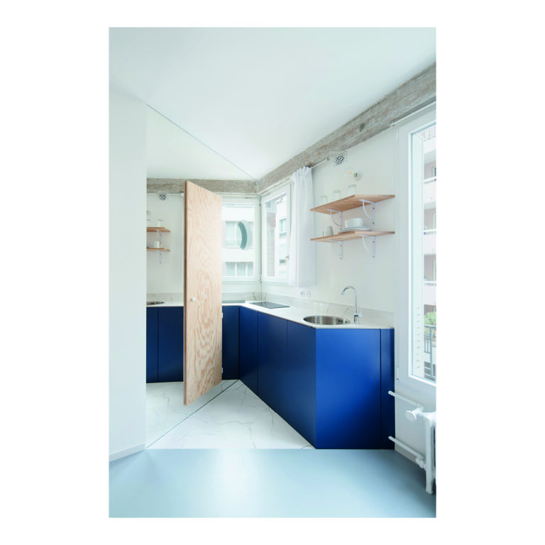
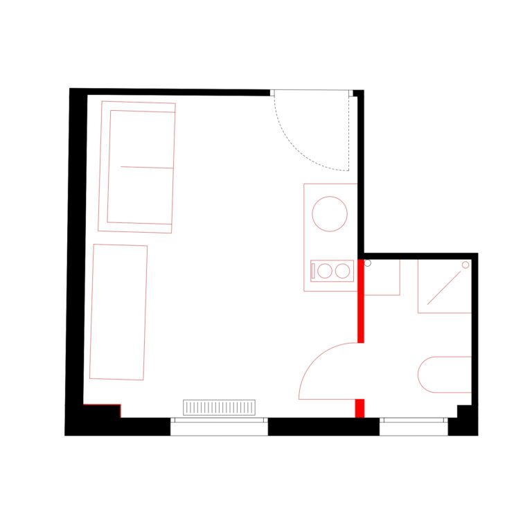
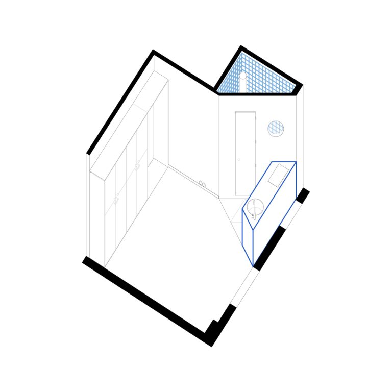
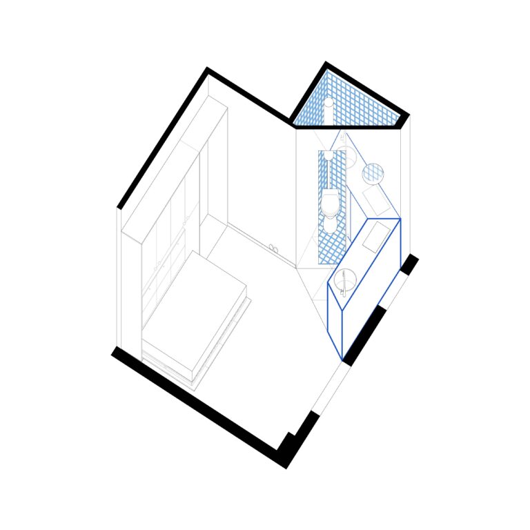
The Gambetta project is a studio of 12.75m², size of the rooms of this former hotel.
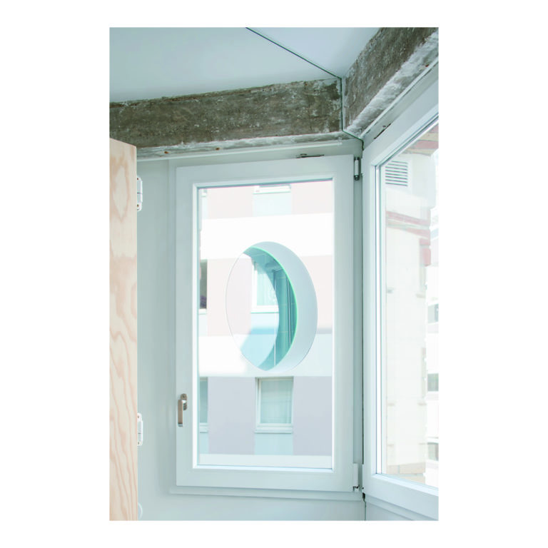
The existing situations are banal, a bathroom too big for the space, one window in the bathroom, one other in the main space, a little kitchen, a big wardrobe, a bed.
The main question is: how can the space feel bigger than it is ?
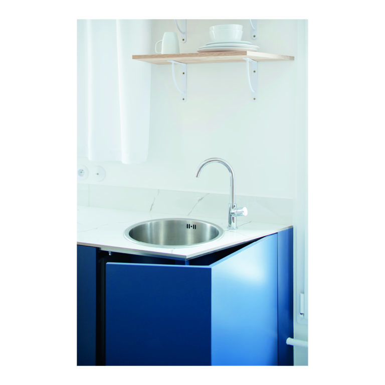
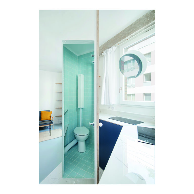
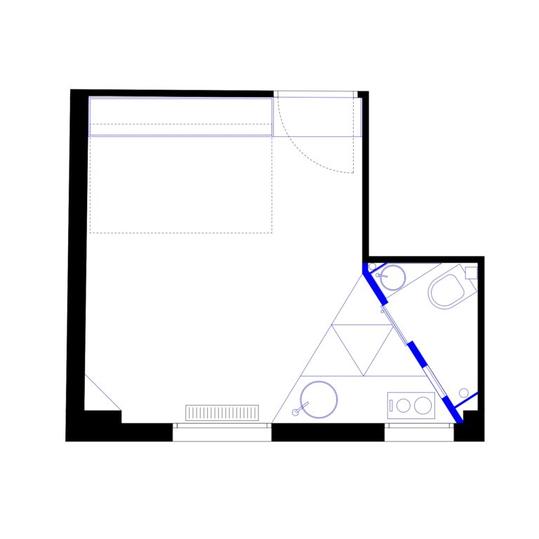
The first action was to destroy the bathroom’s wall to give back the second window for the living space. It was important for us to give the maximum space and light to the living room by compacting as much as we could the technical spaces.
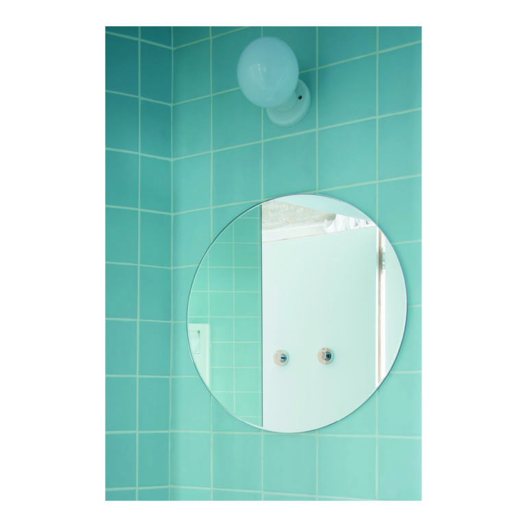
To break the feeling of a small living room, an entire wall is covered with mirrors. One big mirror without joints that give the impression of an extra room. It is interesting how such a huge element, even difficult to bring in, can finally disappear to create more space.
It is important to note that in small spaces we have to keep a certain degree of abstraction that blurs the understanding of the space and dimensions, a notion that we learnt during our work in Japan a few years ago.
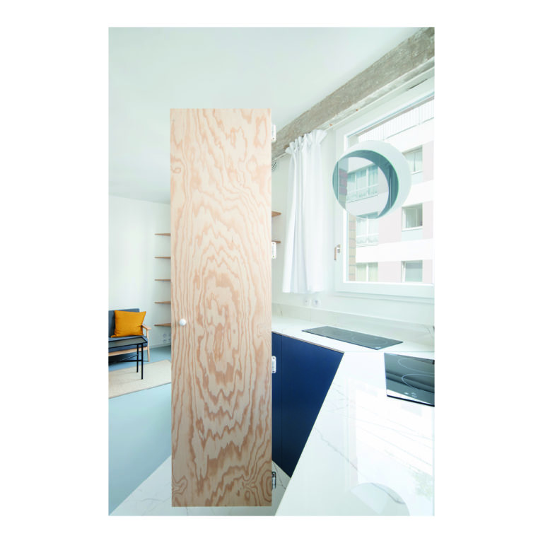
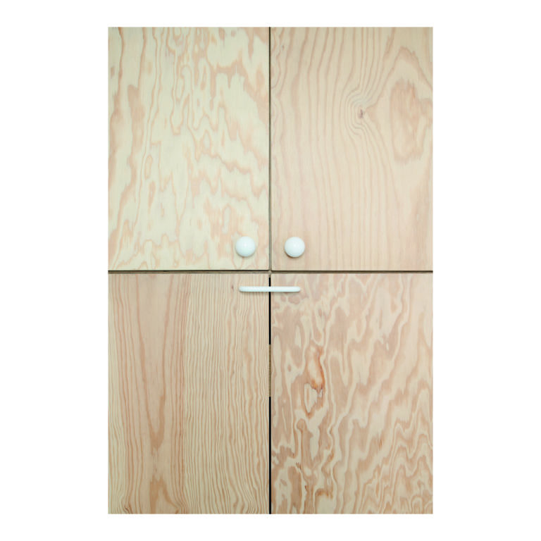
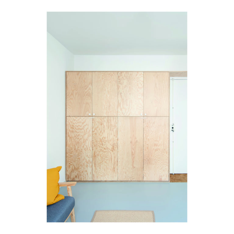
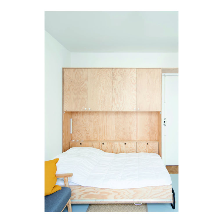
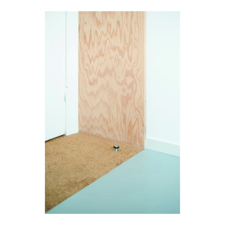
Drawings are guided by strong geometrical shapes, looking for the beauty of plan. Details follow the same idea. The handles have to be geometrical, don’t look like handles, a simple sphere button for the bathroom door and closet. Doors don’t look like doors. The door of the bathroom is a simple pine wood plank in the middle of the mirror, like floating in space. The proportion of the door, 50cm wide, makes it higher.
The wood of the furniture is a very basic one, pine wood, which veins creates ornaments. Pillars and beams in the facade are scrubbed to reveal raw concrete. In contrast with the white and clean aspect of the apartment, this rough surface creates a good balance. It links the flat to the entire building.
Working in such small spaces is really challenging. Even in those small spaces, possibilities are endless. The aim is to find the best balance between functionality and abstraction, with a real attention to details and proportions.
In rehabilitation, we always have to deal with irregularity, unexpected discoveries. The construction site is like a second conception phase, where details have to be adapted, decisions made quickly. The understanding and dialogue with the craftsmen is essential for a good project.
fr//
Le marché immobilier dans les grandes villes comme Paris est de plus en plus tendu. Les loyers s’envolent tandis que les surfaces diminuent.
Dans ce contexte, les habitants sont de plus en plus contraints de vivre dans de petits espaces. Pour les étudiants ou les ménages à faibles revenus notamment, les studios de 10 à 15 m² deviennent la norme. Pour les architectes, ce nouveau mode d’habiter représente un défi, car il nous oblige à maximiser la sensation d’espace et la qualité de vie.
Le projet Gambetta est un studio de 12,75 m², taille des chambres de cet ancien hôtel.
La situation existante était banale : une salle de bain trop grande pour la surface, une fenêtre dans la salle de bain, une autre dans la pièce principale, une petite cuisine, une grande armoire, un lit.
La question principale était : comment faire en sorte que l’espace paraisse plus grand qu’il ne l’est ?
La première action a été de démolir le mur de la salle de bain afin de redonner la seconde fenêtre à l’espace de vie. Il était important pour nous de libérer un maximum de surface et de lumière pour le séjour en compactant autant que possible les espaces techniques.
Pour casser l’impression de petite pièce, un mur entier de miroir. Un grand miroir sans joint qui donne l’illusion d’une pièce supplémentaire. C’est intéressant de constater qu’un élément aussi imposant, même difficile à installer, peut finalement disparaître et créer plus d’espace.
Dans les petits espaces, il faut maintenir un certain degré d’abstraction qui brouille la compréhension de l’espace et de ses dimensions, un enseignement appris au Japon.
Les dessins sont guidés par des formes géométriques fortes, à la recherche de la beauté du plan. Les détails suivent la même idée. Les poignées doivent être géométriques, ne pas ressembler à des poignées classiques : un simple bouton sphérique pour la porte de la salle de bain et du placard, par exemple.
Les portes ne ressemblent pas à des portes. Celle de la salle de bain est une simple planche de pin insérée au milieu du miroir, comme flottant dans l’espace. Sa proportion – 50 cm de large – accentue l’impression de hauteur.
Le meuble lit est en batipin, dont les veines créent une texture ornementale. Les poteaux et poutres de la façade sont poncés pour en révéler le béton brut. En contraste avec l’aspect blanc et épuré de l’appartement, cette surface rugueuse crée un bon équilibre.
Dans la réhabilitation, il faut composer avec les irrégularités, les découvertes inattendues. Le chantier devient comme une seconde phase de conception, où les détails doivent être adaptés, les décisions prises rapidement. La compréhension et le dialogue avec les artisans sont essentiels pour la réussite du projet.